6 weeks of Times New Roman

6 weeks ago, I switched over the font for my newsletter from some web-optimized sans serif font to ugly, old-school Times New Roman. So far, I’ve had two people write in and complain.

One reader said Times New Roman hurts his eyes when he reads my emails in dark mode. Another reader said my newsletter now reminds him of long, factual 2000s websites and the font change made him scroll to the end without really taking anything in.

Has Times New Roman hurt my newsletter?

Like I’ve written recently, I had a record month last month, so it doesn’t seem to have hurt sales. More softly, I keep getting thoughtful and courteous replies from readers, even if it’s sometimes just to say that they’re not fans of the new font.

And the point?

If you read emails from marketers who write daily emails, it’s common to read messages that effectively say, “Heh, it works for me, you can either like it or leave.”

So rather than ending my email with another “Heh it works for me” message, let me tell you the two reasons why I decided to change my newsletter to Times New Roman in the first place. This might be genuinely useful to you, beyond just the satisfaction of agreeing or disagreeing with my attitudes and my personal font choices.

Reason one I switched fonts was that I had a phrase by marketer Dan Kennedy echoing in my head. Dan was softly croaking into my ear, and saying how you want to create a sense of place for your audience, a door that they walk through, which separates your little and unique world from everything else outside.

You might think this is just another way to say, be unique, have a brand, different is better than better.

And sure, that’s a part of it. But a key part of what Dan is saying is that this sense of place should be consistent with the kind of influence you want to have on your audience, and that it should permeate everything you do, beyond just fonts, beyond logos, beyond color choices.

Still, this might sound vague and fluffy to you. You might wonder whether this kind of “sense of place” stuff has a role in the hard world of results-based marketing.

That’s for you to decide.

I’m just putting the idea out there for you, because it influenced me. If you really want an argument for it, then I can only refer you to the authority of Dan Kennedy himself, who helped guide and build up Guthy-Renker, the billion-dollar infomercial company, and who influenced and educated more direct marketers and copywriters than probably anybody else in history, and who was himself responsible for hundreds of direct marketing campaigns and many, many millions in direct sales.

So that’s reason one for the font change.

Reason two is that switching my font to Times New Roman was an instance of my Most Valuable Email trick in action. Yes, this little trick goes beyond just email copy, all the way to font choice, in the right context. If you’d like to make more sense of that, you can find out all about my Most Valuable Email course on the following page:

🦓

https://bejakovic.com/mve

Why I’ve just sent you the only Times New Roman newsletter you are likely to read today

This past Wednesday, I found myself mystified by an article titled The Reaction Economy. It was written by a William Davies — “a sociologist and political economist” — in the London Review of Books.

Davies was complaining about Twitter, and how he is trying to wean himself off it, and how his brain screams to set the record straight whenever it sees idiotic conservative tweets. But Davies is a disciplined person, so he didn’t give in to the urge and get back on Twitter. Instead, he went and wrote a 6,276-word article in the LRB about it.

As I read this, I found myself mystified why I was reading it at all. I mean, what was fresh here? Some guy saying he wants to use social media less? Or a liberal airing his lungs about conservative trolls? Or an online pundit shaking his finger and warning me, as I nod along in silence, that social media is designed to provoke outrage?

And yet, there I was, reading, paragraph after long paragraph. I asked myself why. One small part was the good headline, The Reaction Economy. That sucked me in initially. But what kept me going had nothing to do with the actual content, which was neither new nor insightful.

I realized that the real reason I was reading was that the article was hosted on the LRB website. Beyond that, it was the formatting — 10-line paragraphs, drop capitals, Times New Roman font.

Copywriter Gary Bencivenga once told a story of how his ad agency rushed an ad into the New York Times. In the rush, the NYT typesetters set the ad with a sans-serif font. Gary’s agency complained, and the Times offered to run the ad the next week, for free, with the correct serif font. This was not a proper A/B split test. Still, the serif ad ended up pulling 80% more sales than the sans-serif ad the week earlier.

Is there really sales magic to serif font? Probably not. But we use cues all the time to decide on value, and to guide our decisions. I’ve written before how I find myself unable to spend more than 20 seconds reading a 700-word blog entry or email newsletter, but that I’m happy to read a four-volume book of 1,900 pages for more than a year.

Quality of content is a part of it, but only a part. The fact is, I use cues all the time to evaluate that quality, and I rely on past habits to determine what deserves my attention or not.

So my point for you is is, why stack the odds against yourself? Why give your reader subtle cues that your writing is skimmable, disposable, low-value fluff? The bigger principle, which I’ve seen proven in different areas of life, is: Assume people are already acting how you want them to act. Very often, they will end up doing just that.

Since you’ve read this far, I assume you must be a reader. So I will remind you that, for the next three days, until February 27th, I am opening the doors to my Insights & More Book Club. After that, I will close off the club to new members. We will start reading the next book on March 1st, and it makes no sense to have people join mid-way. The only way to join is to be signed up to my email newsletter first. If you like, you can do that here.

The beautiful future of text sales letters

“All train compartments smell vaguely of shit. It gets so you don’t mind it.”
— Ricky Roma, Glengarry Glen Ross

Right now, everybody’s so in love with copy.

In certain circles, this love even goes further, to a certain pride about ugly websites and ugly emails and ugly sales letters. “Who cares? If you’re interesting, if you write well, people will read your message even if it’s written on used toilet paper!”

There are even people who claim they’ve tested this. They claim that ugly, because it stands out, outperforms beautiful.

I can believe this. But here’s the thing:

If everybody’s making an ugly website in the hope of shocking people into handing over their attention… then ugly stops being different.

It gets so you don’t mind it, like Ricky Roma says in the quote above. And at that point, ugly loses its selling power.

I bring this up because I’m listening to an interview right now that Rich Schefren did with a marketer named Sean Vosler.

Rich spends the first five minutes of the interview enthusing about Sean and his work. Rich thinks this is the future of marketing.

He even gets so excited that he pulls up his text messages on screen, to prove how he just had an exchange with Jay Abraham, and how he invited Jay to join this interview. Rich thinks Sean’s stuff is so revolutionary that even Jay needs to see it.

So what exactly is Sean doing?

Well, he is selling a book about copywriting. That’s not unusual. What is unusual is that the book and its sales page are very professionally and beautifully designed (by Sean himself, who has a a background in design).

The point, as Rich puts it, is that “different is better than better.”

And in a world where many marketers are taking pride in making garish-looking sales pages… or sending boring and plain-looking emails (like the ones I send out in my email newsletter)… in that world, a beautiful design like Sean’s looks different. It gets attention. And that’s half the sale.

By the way, this is part of a bigger trend.

Last autumn, I wrote about a similar move to higher production values in VSLs. And now text sales letters seem to be headed in the same direction.

So if you are a marketer or business owner, this beautiful design stuff is something to keep in mind.

And if you are a copywriter, this is something you can bring up to your clients, and make yourself seem well-informed and cutting-edge.

But wait, you might say.

What exactly makes for beautiful design in a marketing context?

I can’t say. I’m not a designer. But if you want to see Sean’s sales page, the one Rich Schefren was so enthusiastic about, here’s the link so you can judge for yourself:

https://bejakovic.com/sean-vosler

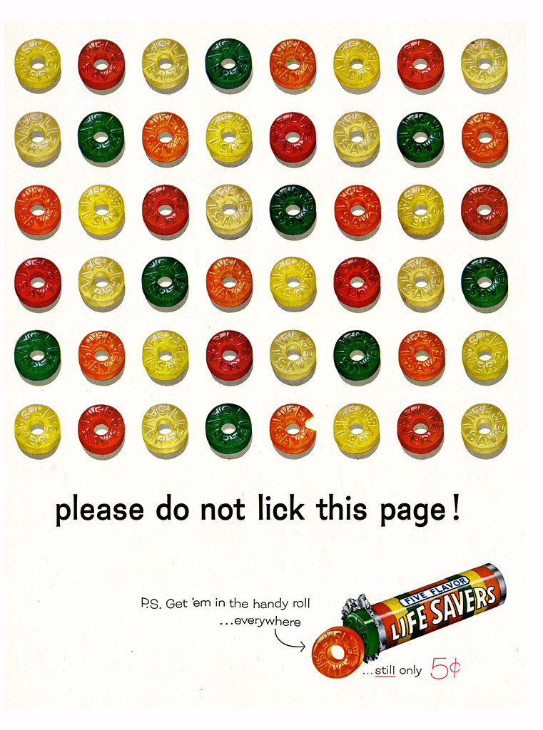
Please do not lick your screen

Today, I’ve got a sample of “old school cool” for you.

It’s a piece of Madison Ave advertising that 1) looked great and 2) apparently sold tons of product. It ran in magazines all around the country for years, in the 1940s and 50s. And in spite of the prohibition in the headline, parents apparently caught their kids licking the page.

I bring this ad up, not just cuz it’s cool, but because it also illustrates a few important marketing points:

1. When all else fails, just sell the damn thing.

2. You have to “build vision,” and images can often be the best way to do so.

3. Your headline should enter the conversation already going on in your prospects mind. In this case, there’s no point in saying, “These suckers are delicious!” Kids already knew.

Anyways, here’s the ad — just make sure to heed the warning in the headline: