
Tom Selleck is not backing down.
He recently came out with a new miracle cure — an erectile dysfunction pill that’s so effective, so safe, and so affordable that major pharma companies are shocked and outraged.
They are trying to silence Tom and get him to stop selling his Viagra-killer.
But the former NRA spokesman isn’t intimidated easily.
He just went on Dr. Phil’s show to make a stand against Big Pharma — and give away free samples of his pill to anyone looking for a hard-on.

Now if you haven’t seen the episode of Dr. Phil with Tom Selleck, don’t worry. You didn’t miss anything.
There never was such an episode.
And old Tom never created or endorsed a new ED pill.
It’s just some stuff that I read in an advertorial today. Let me explain.
Advertorial vs. Advertisement
As you may know, an advertorial is a special type of advertisement. It’s special because it looks and feels like a neutral article. In fact, that’s where the name comes from:
Advertorial = Advert(isement) + (Edit)orial
Back when newspapers rolled off printing presses, advertorials looked like newspaper articles (aka “editorial”).
Today, an advertorial can look like an online news article (like the Tom Selleck advertorial above). It can even look like an impartial blog post on a personal website (more on this in a second).
You might think that’s kind of sneaky. It’s like when Frank Abagnale dresses up as a TWA pilot… flashes a big smile… and gets to fly on an airplane for free.

But maybe an advertorial is just a chocolate-covered pill. It’s still just an ad. It’s just easier to swallow — and it might even be good for you.
If you’re not convinced, I don’t blame you. We’ll talk more about this below in the section Are Advertorials Ethical? But first, let’s look at the relationship advertorials have to their other parent, plain editorial articles.
Advertorial vs. Editorial
In a nutshell: A normal news article (aka editorial) should be unbiased. On the other hand, an advertorial is biased by design.
After a bit of practice, it becomes easy to tell if an article is “genuine news” or if it’s actually an advertorial. But there are cases where it’s not so easy to make the distinction.
For example, take this article on MarketWatch:

This article was written by a MarketWatch staff writer (Andrea Riquier). It seemed to be a simple piece comparing different online companies in the real estate space.
But by the time you finish reading this article, one company, Knock, comes out as the definite winner. And just in case you didn’t get the point, the article wraps up with the following:
“Not everyone will choose to work with a disruptor like Knock, but it — and old-fashioned real-estate agents — at least have the same motivation as the homeowner: maximizing the sale price. In contrast, as a customer of an iBuyer, a homeowner is on the other side of the deal.”
I don’t know the inside scoop behind this article. Perhaps Knock paid for it. Perhaps they provided it for Riquier ready-made, and she published it under her byline. Perhaps Riquier just wrote up her own views, which came out so in favor of Knock.
In any case, I want to point out one thing:
There can be a lot of gray between unbiased editorials and full-on advertorials. Which brings me to the next section, where you can see some examples of advertorials in the wild.
Advertorial Examples
I already showed you a couple examples of advertorials above. But advertorials come in many different shapes and sizes. Here are some more:
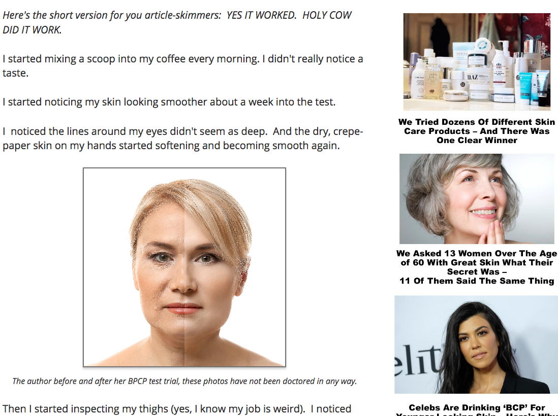
Collagen from Healthy Living Association
This “review” article looks like it could be on women’s magazine Bustle. It’s got pictures of celebs… links to other articles (all of which also promote the same product)… and even a collection of Facebook-lookalike comments at the bottom.
But the article is written by an employee of the company making the collagen supplement. Not surprisingly, the advertorial is all about how the collagen made by this company is amazing.
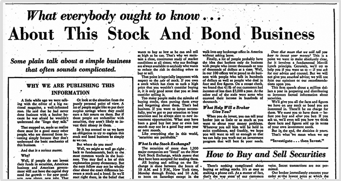
“What everybody ought to know…” by Merryl Lynch
Advertorials are not something that just popped up on the Internet. Below you can see an advertorial that ran in the New York Times in 1948. It was put out by Merryl Lynch and it explained the basics of investing. Notice how it looks and feels like a newspaper article — just a little more intriguing.
Child predator advertorial by Bark
Bark is a company that sells a technological solution to stopping child predators. Medium is a website where people typically publish personal blogs and opinion pieces.
This article, published on Medium, reads like a personal blog post. But it’s not. It’s an advertorial written by an employee at Bark. Its goal is to highlight the problem that Bark claims to solve — and to get the Bark name out there.

Iron Man advertorials by Marvel Studios
The basic advertorial principle — mixing regular content with promotion — can be used in other media too. For example…
About 10 years ago, most kids had never heard of Iron Man. So Joe Quesada, former comic book artist and CCO of Marvel Comics at the time, commissioned three Iron Man “advertorials.”
These were animated shorts with simple stories, designed to introduce Iron Man to kids as a cool, superpower-armed, human superhero. The advertorials were crucial in launching the Iron Man movie franchise, which has grossed hundreds of millions of dollars for Marvel.
This is an “advertorial cartoon” that launched the Iron Man movie franchise
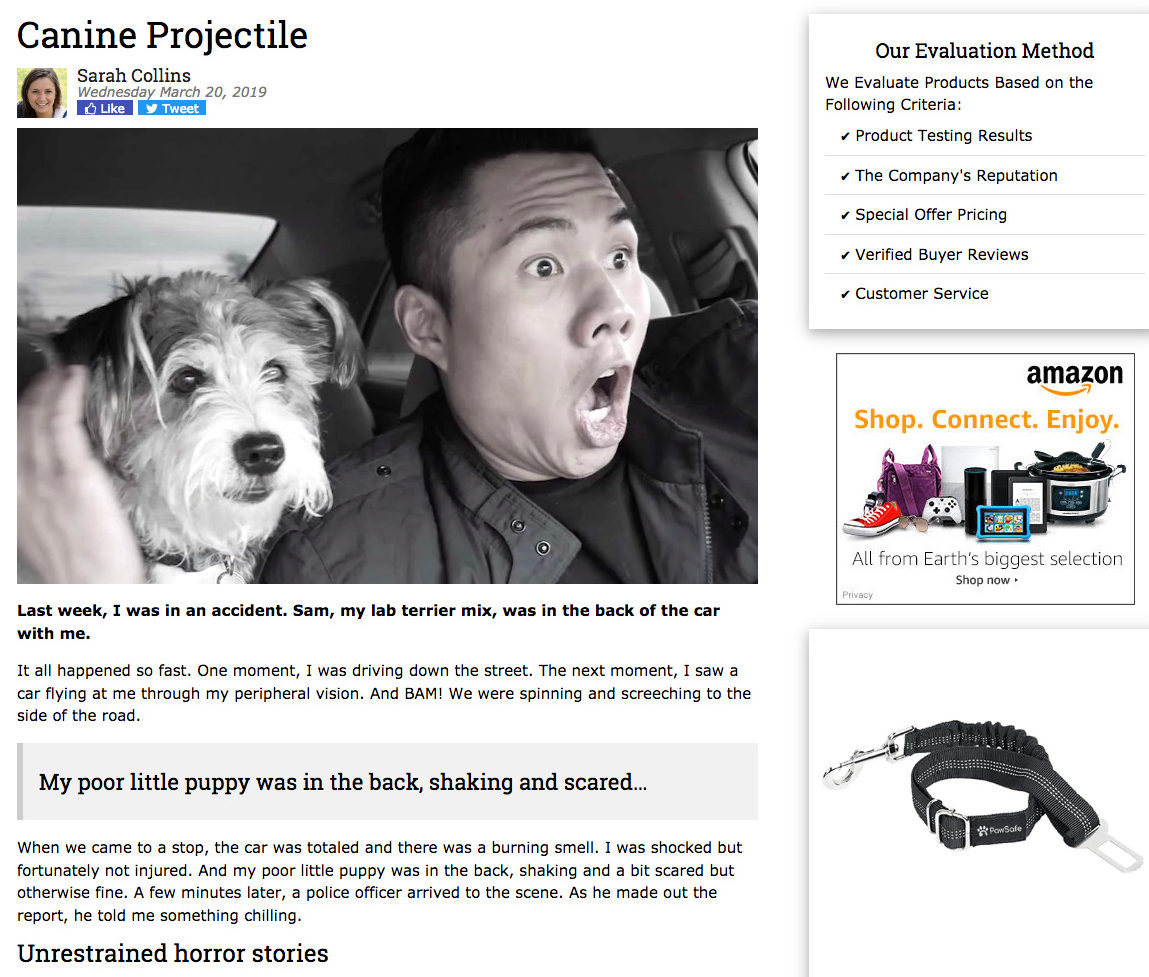
“Canine projectile” by PawSafe
Here’s another advertorial in the form of a first-person blog post. It’s promoting a “seat belt” that keeps dogs from sailing through the car in case of a crash.
I’m including this advertorial for two reasons. First, because I know for a fact that it was very effective (more on this below). Second, because I wrote it. How’s that for a combination of content and promotion?
Product comparison by AMD
Back in 2017, the review site TechPowerUp published one of its (seemingly) standard review articles. The article compared two graphics chips — one from a company called AMD and one from a competitor of AMD’s.
The article had a nice impartial tone… lots of useful information… a pretty graph, too. It also featured a big, fat AMD logo up top and a sign that said, “Advertorial by AMD.”
What do you think happened when this article hit thousands of skeptical tech readers? If you want to find out the furious fate of this advertorial, check out the next section, Are Advertorials Effective?

Are Advertorials Effective?
I started this article by telling you about the Tom Selleck advertorial. That advertorial worked like crazy. I know because I saw it in Newsmax — a right-leaning email newsletter — dozens of times.
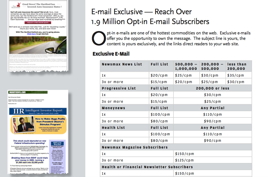
Each of those ad placements costs tens of thousands of dollars. This means the guys who run that advertorial are making much more money, each time their ad runs.
Here’s another example of the effectiveness of advertorials. These two ads are the same — except for the design:
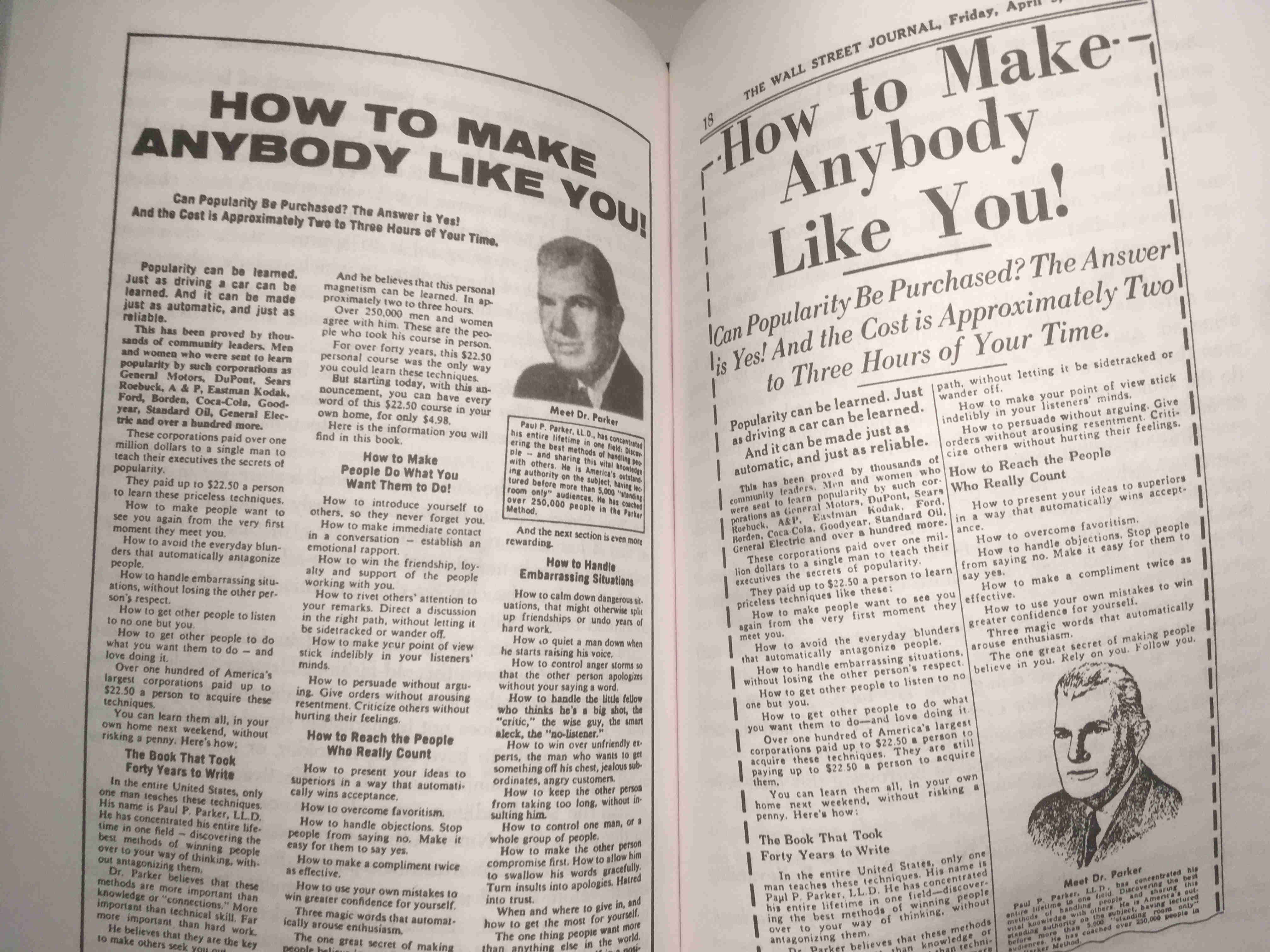
According to legendary copywriter Gene Schwartz:
“The first is an all-purpose, house-set magazine ad that was shotgunned over twelve or fifteen media. It was mildly successful.”
“The second is the same ad, adapted feature for feature for the Wall Street Journal. it was enormously successful — so much so that it’s been repeated nineteen times, once a month, with no drop-off in pull.”
What about the advertorial examples we saw above? Were they effective?
First, let’s cover the “What everybody ought to know…” advertorial by Merryl Lynch. This advertorial consisted of 6,000 tightly printed words. At the end, it asked readers to write in for a pamphlet if they want more info. Over the lifetime of this advertorial, which ran for over a decade, tens of thousands of people wrote in. I’m sure many became Merryl Lynch customers.
In a more modern setting, I can tell you about the blog-style “dog seat belt” advertorial above. Like I mentioned, I wrote this advertorial, and I know the numbers behind it. It brought in 4X returns on Facebook ad spend, and it ran successfully for months.
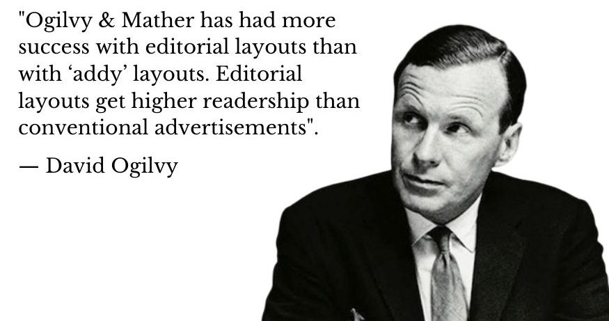
So yeah. Advertorials can be very effective. As a second legendary copywriter, David Ogilvy, put it:
But making a plain ad into an advertorial won’t automatically make it a success. Advertorials still have to be interesting and well-written. (We’ll talk more about that in the section below on Advertorial Best Practices.) And in some cases, advertorials can actually perform worse than a straight-up ad might.
Take for example the AMD advertorial I mentioned above. That advertorial got hundreds of booing and jeering comments on the TechPowerUp site. People thought they were being manipulated, and rightly so. Many commenters went even further. They argued the AMD chip — which actually came ahead in the review article itself — must be a worse product.
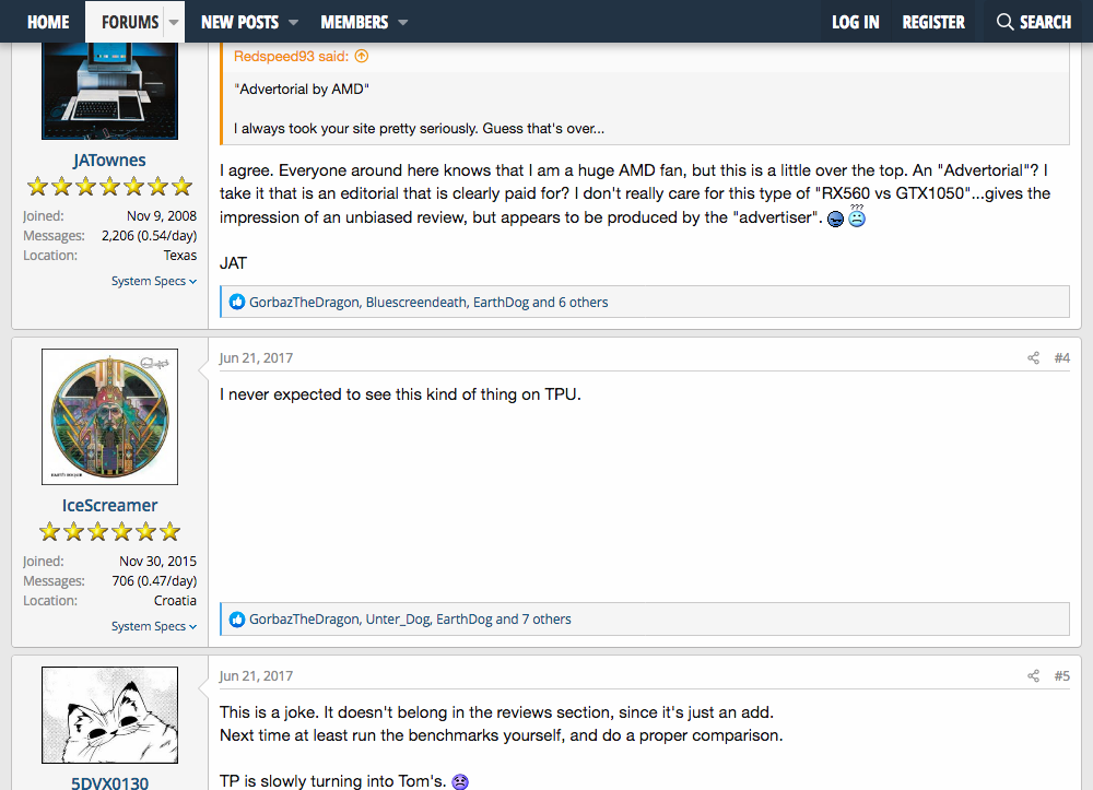
In short, advertorials can be very effective. But in certain markets, readers can be very testy. If they realize they are reading an advertorial, they can turn on you.
Some advertisers have figured out ways around this, which I’ll talk about below in the section on Advertorial Best Practices. But first, I have to address a question that’s been bubbling up since the start.
Are Advertorials Ethical?
As you’ve seen so far, advertorials are ads camouflaged as other types of content.
Maybe they look like newspaper articles… or online news… or first-person blog posts. Much of their effectiveness depends on this camouflage.
When you put it this way, I don’t think there’s much debate:
Advertorials are not ethical. Their whole point is to leach some credibility through their design, and to use this to influence buying behavior. I once compared it to Tony Montana in Scarface, stumbling around and yelling, “I always tell the truth. Even when I lie.”

So in some way, all advertorials are unethical. But there are different shades of unethical here:
1. At one extreme, you have advertorials that bamboozle readers. The Tom Selleck advertorial up top, with its made-up story of Dr. Phil and Big Pharma, promoting a shady ED pill, is pretty bad in my book.
2. At the other extreme, you have advertorials full of valuable information. Two examples are the Merryl Lynch and “child predator” advertorials we already covered. (You can see both of them up top in the Advertorial Examples section.)
3. In the middle, you have all the other examples of advertorials we’ve seen so far. Yes, they are biased while trying to appear unbiased. But maybe that’s ok — if what they sell is good enough.
Here’s a rule-of-thumb for advertisers about this, from former Boardroom VP Brian Kurtz:
“Think about how valuable the product or service you are selling is to your audience and how much you believe that getting it into as many hands as possible is a game changer for them… and that you have almost a moral responsibility on your part to get it to them.”
“Do all of this while staying true to your principles and not losing sleep while making claims you feel are necessary to get your genius into the world in the biggest way.”
But maybe you don’t think that’s good enough. Maybe you don’t think that advertisers should be the ones to decide about how deceptive their advertorials can be.
In that case, you’ll be happy to know the federal government has stepped in, with the following guidelines.
Advertorial Guidelines
In 2015, the Federal Trade Commission published a document called Native Advertising: A Guide for Businesses. This document outlined rules about camouflaged ads like advertorials.
In a nutshell, the FTC said that advertisers cannot fool customers. Advertisers have to clearly mark an advertorial as an ad. For example, they can write “This is an advertisement” on some prominent place on the page.
And in fact, some advertisers do this (like AMD with their failed campaign above).
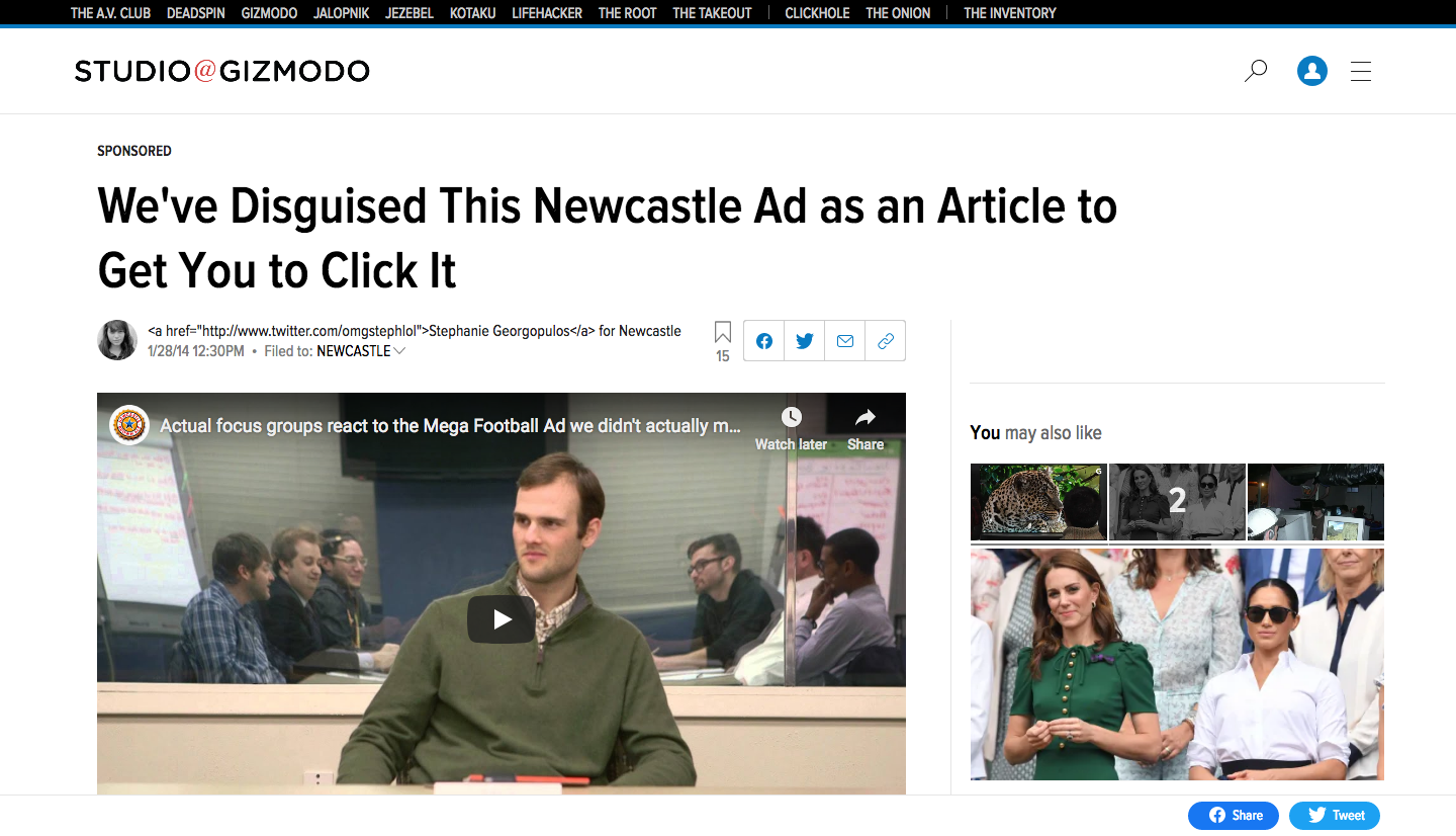
But others advertisers still don’t disclose anything. In theory, the FTC could come after them. And maybe one day they will. But I wouldn’t hold my breath.
Since publishing its 2015 guidelines, the FTC has gone after only one advertiser for breaking these rules. That was the Lord & Taylor department store. As part of a big advertising campaign in 2016, Lord & Taylor paid for an advertorial on a fashion site. And they did it without disclosing it was an ad.
According to FTC guidelines, this was an open-and-shut case of misleading advertising. And so the FTC handed down the verdict, which boiled down to:
“The proposed consent order prohibits Lord & Taylor from misrepresenting that paid commercial advertising is from an independent or objective source.”
Did you get that? The FTC told Lord & Taylor, don’t do this again. To which Lord & Taylor said, ok. And that’s it. The totality of what the FTC has done so far about misleading native ads, at least according to what’s up on the FTC site.
It seems the federal government won’t do much when it comes to advertorials, at least for now. That might be bad news for consumers… but good news for advertisers. Speaking of advertisers, how should an advertorial look if you want to write one yourself? Let’s look at that next.
Advertorial Design
The basic principle of advertorial design is camouflage. We saw this in the two versions of the “Make Anybody Like You” ad. The more closely an advertorial looks like the surrounding content — whether that’s a newspaper, a magazine, or a website — the more likely it is to succeed.
What about first-person, “blog-style” advertorials? Well, you might think they should look like personal, non-commercial, independent blog posts as much as possible.
But here’s the thing. Marketing is often counter-intuitive. Take for example the “Dog Seat Belt” advertorial above. It featured a bunch of glossy infographics, “buy now buttons,” and “cutaway” boxes that said “Here’s how to get a PawSafe dog seat belt for yourself.” In other words, it was clear this wasn’t really a personal blog, but an advertisement instead.
And yet, customers didn’t care. Sales increased by putting in all these “addy” elements. As with all direct marketing, this is something that should be tested. Here are a few more advertorial best practices.
Advertorial Best Practices
Without much ado, here are some advertorial best practices. These are based on my careful study of advertorials in the wild, as well as feedback from clients i write advertorials for:
- Multiple links. All advertorials I’ve ever seen feature multiple product/service links, worked in throughout the text. But be careful: put a link too soon and you might decrease sales. At least that was the experience of my clients when they tested it.
- Only one link target. All links only go to the sales page or order page. Don’t link to your blog, to other sites, to your home page, etc. All links go to the same place, where the reader can buy.
- Stories beat “news items.” First person stories tend to drive more sales than news-style advertorials. This might not be true universally. But at least for ecommerce products, it’s been tested and shown true.
- Images — or drawings. Images in advertorials are important. They can attract a lot of attention to links around them. In my clients’ experience, drawings or illustrations can work better than photographs.
- Insulating the main brand. Companies with well established brands can suffer an image problem by running advertorials (like AMD above). One solution is to create a second website or even a second brand that publishes the advertorial, and then links to the main brand.
How to Write an Advertorial
One way to write an advertorial is to start with a news article, and twist it to have an agenda. This is what many advertorials online do. And they do it successfully.
But be warned. Advertorials can fail. In other words, it’s not enough to “camouflage” an ad and expect it to make sales.
Successful advertorials are interesting and provocative. And they obey copywriting basics like a having a good headline, leading the reader on, and using simple language.
If you want more info on how to write an advertorial, I’ve got an offer for you. Click the button below and sign up for my daily emails. That’s where I talk about copywriting and how to write an advertorial. Much of the page you’ve just read is a collage of emails I’ve sent to my subscribers.
Plus, I’m preparing a training course on how to write first-person, blog-style advertorials like the “Dog Seat Belt” one above. Once I have trial versions of that program available, I will send out notifications to my email subscribers.
